
Putting the Map in Roadmap: visual product roadmapping
Because some times a picture is worth a thousand words.

Over the years I’ve used many visualisations to drive home a point, particularly around planning and road-maps. A picture is worth a thousand words, and all that (and I should know — I’m an author 😅). Even my favourite mental model to picture the essence of product management has a visual component.
This post collects a few of the visualisations I’ve created over the years. The aim is to show you that (a) graphic design skills, or even basic taste, are not a requirement, and (b) maybe spark your thinking and improve your communications when it comes to road-mapping.
Just remember: a road-map is a tool to communicate strategic direction. It’s not a project plan! And communication should go both ways — you should get as much opportunity to learn as to deliver a message. Communications are 90% of product management, and visual tools are just another way to reach your audience.

The Evil Empire
Let’s start with what absolutely does not work. You know those tables with quarters and features, that are near enough to a Gantt chart to make any MBA’s heart warm? Yeah, those.
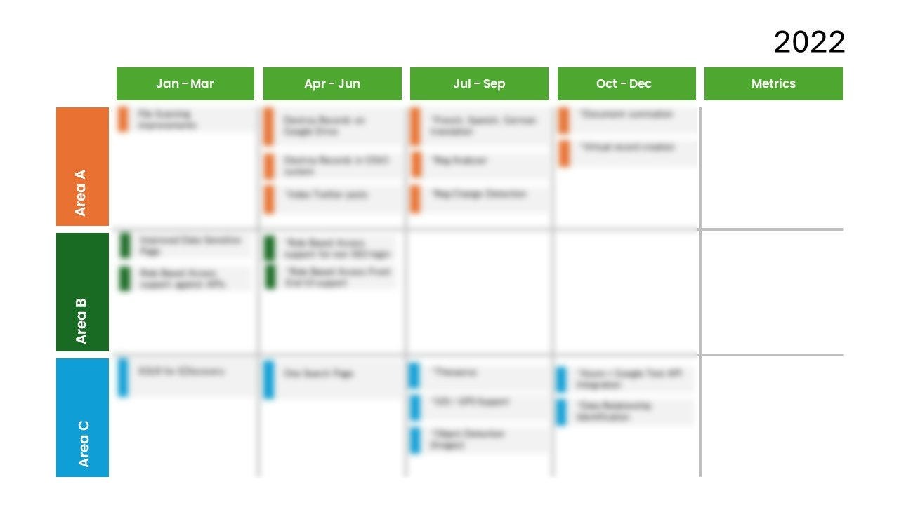
I’ve basically seen variations of this at every company, and they never work. Once I’ve seen the same roadmap (over 90% same content) with just the year tag at the top that changed!
And at that point, the executives usually ask you to do the same for next year, but please make it “accurate”. When you point out that if you keep doing the same thing you’ll get the same result and perhaps we could try something else, you get told "fine, but I still need to know by which date are we delivering features X, Y, and Z.” 🤦 It’s a long slog uphill, what can I tell you. The below visualisations offer ways of (hopefully) viscerally showing the constraints of resources and projected strategy towards achieving a vision.
Technical Roadmaps
These focus more of the content (features and modules) of each release, for internal consumption. The why behind them could then be discussed, which is kinda the point of many roadmaps. They have a greater focus on deliverables, but work when people understand the cone of uncertainty and agree that what we think now is liable to change when we ship and learn.
The first release
The first one was done early in my career, and early in the product’s life cycle. It was in the Zero-to-One phase of the product, where we were still building the first releaseable version. Note that it was replacement for a previous product, so we had a good idea of what the market wants (think Kano’s table-stakes and delighters).
The aim was to communicate with internal stakeholder what we’re building first, why, and where are we with getting it on. Top-bottom was priority (above the axis for v1, below for future), and left-right was the server/desktop products. The triangle as part of the top-right (first desktop release) was the bare-bones beta. Size of bubbles showed estimate of size of work.

At some point I think even got fancy with weekly updates and filled some of the bubbles with red-green gradient to show progress on elements.
Note that time wasn’t on the visualisation, but importance (y axis) and effort (size) were. The team and stakeholder could then discuss the reasoning behind each of the functional components, the choice to include it in the first release, or perhaps break it down, etc.
Again, I’ll remind you that we were replacing an existing product, so we knew the table stakes we have to hit to replace, and then the delighters (like a server product) for future growth. Not everything got built in the end, naturally, but the image provided a good snapshot of our understanding of the market and a basis for internal discussions from which actions could be derived.
Version 3 — adding AI
We did it before it was cool 😉
Same product as above. The first version was to break into the market (we got 90% conversion from the old product we were reselling!). The next version expanded the problem significantly, and after a couple of years of hemming and hawing, we decided the market was ready for us to add AI.
We split the work across two streams. One that was taking care of the old product and preparing certain aspects to be consumed and controlled by the machine learning algorithms, and another that focused on making those algorithms as accurate as possible. To visualise the dependencies, I drafted the following swim-lanes.
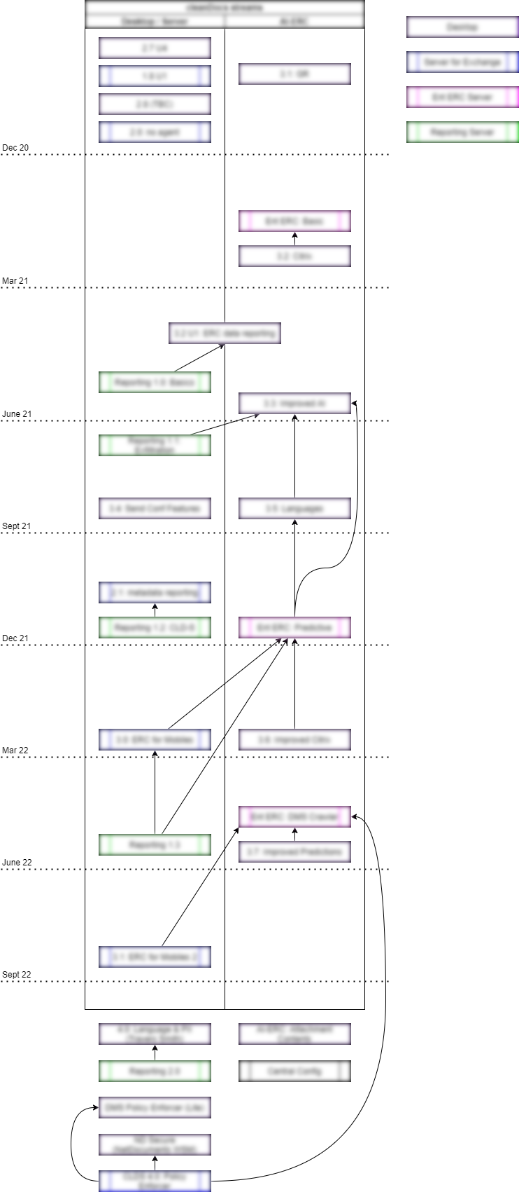
Time flows top to bottom, in case you can’t make the quarter tags, and each rectangle is a release. (And before you chew my head off, remember that large enterprise customers don’t want more frequent releases — it’s a big headache for them to deploy non-SaaS products). Components were colour-coded and dependencies linked, as by that point the product was a portfolio (desktop, server, API).
The main objective of this "roadmap” was to answer the perennial question PMs get asked: why can’t I get my pet feature next quarter and close a deal? (Why? I’ll tell you why! Remember those things you promised the other customers and we told you were dependent on some background work, while working on the company’s strategy of AI? That’s why!).
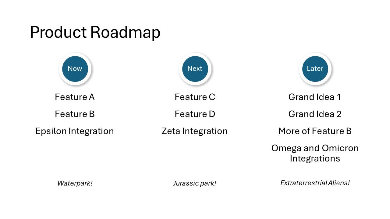
Now | Next | Never
Now we get to the Product world’s favourite format. The beauty of this format is that it let’s you talk about about where you think you’re heading with the product, putting enough caveats around the “later”, and gauge interest.
I started to build these as an answer to the obligatory table with “Quarter / Feature” that puts dates and scope (with a fixed team, of course) that were obviously inherently broken but no one could let go of. I used these subversively (ie without official sanction), and got much positive feedback from customers, sales, and the executives who didn’t sanction them in the first place 😉
The Basics
This is the first such slide I created, to cover the basics. While talking to it, the “Now” was due for imminent release or just released. ie 99% confidence it’ll go live. It told Sales what to focus on, and customers what to look out for.
The “Next” was was what selected for the next release, and was probably at over 60% confidence that will be included (barring some inevitable technical dramas of ‘you-can’t-get-there-from-here’). The “Later” listed things we’d like to explore further, with an absolute no guarantee of if-and-when we’ll ever get to them.
I also included themes under each one, which helped explain the direction (core feature, more integrations, etc).
The funnel
When that wasn’t enough for some execs, and they still couldn’t quite fathom how we can’t just “bring everything forward”, I switched to a funnel visual.
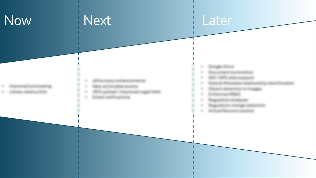
The idea was to viscerally show that you can only push through so much at the “now” phase. It’s just too narrow than to fit more than two items at a time. There are limits to work in progress, and this visually demonstrated the point, plus the increasing uncertainty about what might get picked up from the “Later” column. As each sprint/month/quarter rolled by, only select items could be pulled to the left. That also still allowed to have the same conversations as above, showing possible future directions.
Return of the funnel
The particular company I created this for was a bit of a mess, an early-stage startup whose idea of strategy was “do whatever the next paying customer asks”. Since they were trying to sell their solution to multiple verticals (it legitimately was applicable, but the ‘context switching’ of needs was hurting us), I wanted to show how an embarrassingly narrow focus into verticals could help get more bang for the back.
For this, I reused a similar funnel but threaded possible customer types/segments to go after. It showed how you can quickly build up to dominate a niche, and then just to other close niches. And, conversely, how not doing so would end up taxing out limited resources and not making any real progress in any specific vertical. Try to please everyone, and you end up pleasing no one.

The map started with existing customer segments and the current work, and showed how we could possibly build up on them rather than constantly switching around. For example, how quickly can you dominate the higher-ed market, or the utilities, before trying to just to financial services or defence industries that have distinctly different needs.
Can’t say I carried the floor with this, but at least the discussion was lively and I didn’t my best to prevent the inevitable demise of the company.
That’s it, at least for now. I’m sure those won’t be the last of the visualisations I use — whether for roadmaps or other needs. I hope I gave enough examples how laying out information like that helps nudge the conversation in the right direction.
Note also that none of the graphics were fancy. Most were done in PowerPoint or the basic drawing program of your choice (Draw.io for a decent free product; Miro if you’re one of the cool kids can do most of it). All it takes is a spark of creativity around the main message, some time obsessively aligning rectangles, and constant refinement as you go.
Hope this helps! Remember that like any communication, it’s about the audience and what you need to get out of it (learn something, convey something). Visuals are just another tool. I’d love to hear about what sort of visualisations you’ve used, and how effective (or not) they were.